RoosRoast
Adding cohesive branding to the coffee roaster’s website and improving the checkout flow process with the goal of increasing successful checkouts.
Duration
8 Weeks
Platform
Mobile + Desktop
Role
UI/UX designer
About the Client
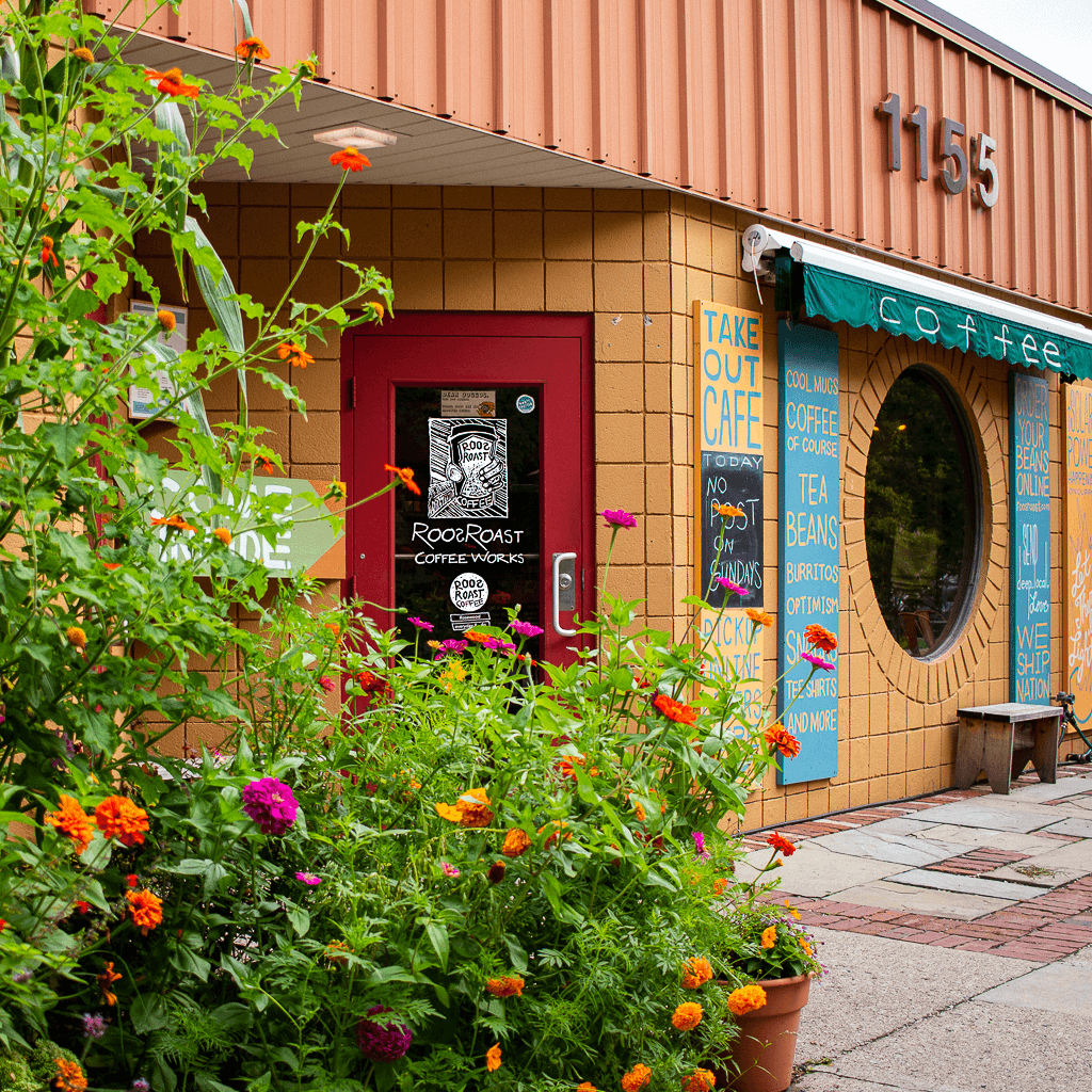
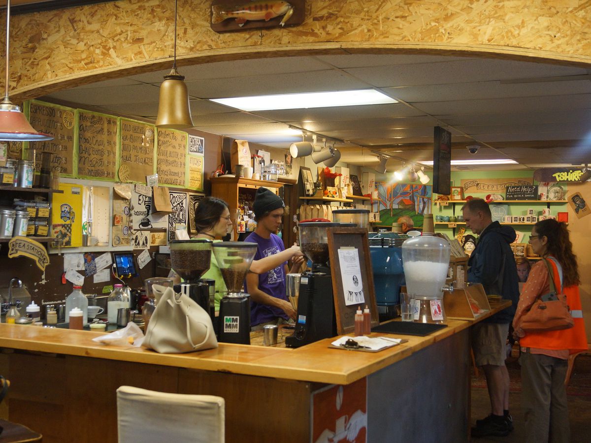
RoosRoast is a coffee roaster local to Ann Arbor, MI. The company has two physical locations that serve their coffee and engage their community in an environment that displays their unique personality. To name a few unique aspects, there are hand-drawn sketches on walls and ceilings, community-gifted items displayed around their stores, and arcade games in a casual environment with enthusiastic staff. RoosRoast is also extremely passionate about sustainability and has been fully running on solar power in its first location since 2020.
Their Goal
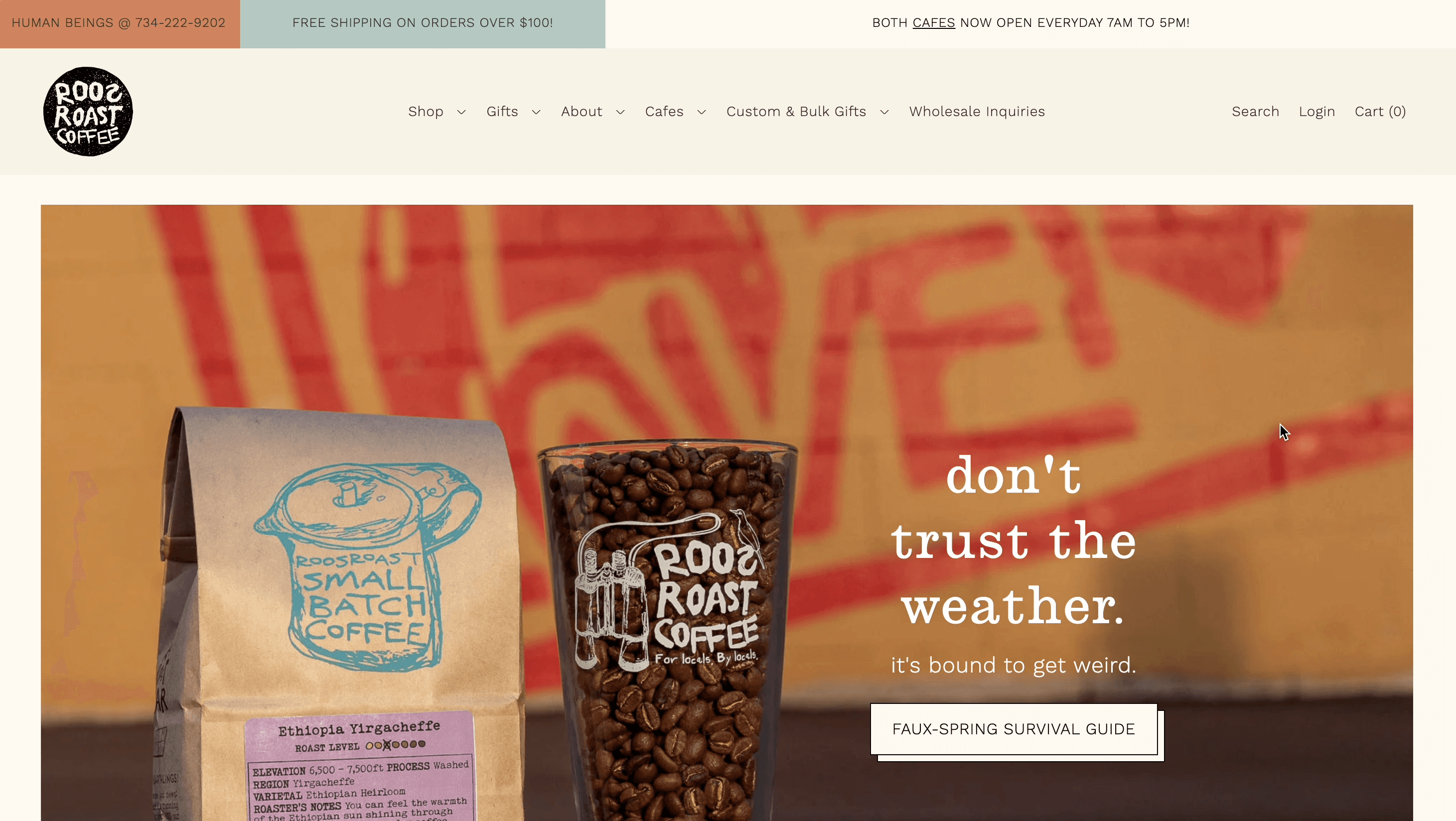
While achieving success in their physical store and growing their online store, RoosRoast wishes to further improve the business by extending the sense of warmth and community that customers experience in-person in their stores to their online presence. Currently limited by the template style of the existing Shopify website, the company wishes to create a more comprehensive custom web shop that fully captures the essence of who they are. The overall intent is to improve the customer experience, increase conversions, and expand the business.
Our Mission
With one other UX designer, we set out to define and achieve RoosRoast’s goals through a research-backed design process. By adding cohesive branding, simplified customer navigation, and increased checkout efficiency, we aimed to streamline the user interface, enhance the user experience, and improve business metrics.
Mission 1
Updating Branding
Mission 2
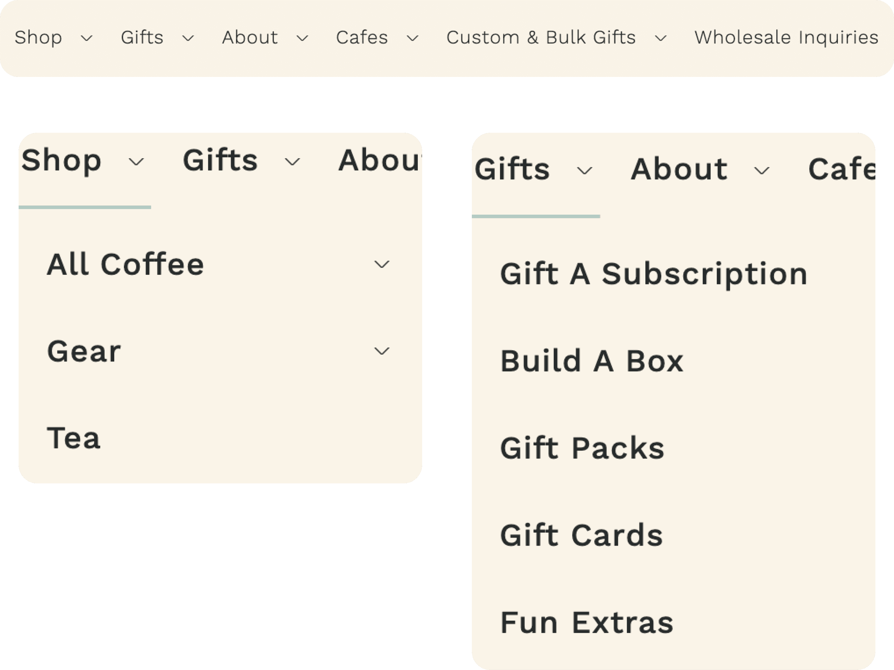
Redesigning Navigation
Mission 3
Increasing Checkout Efficiency
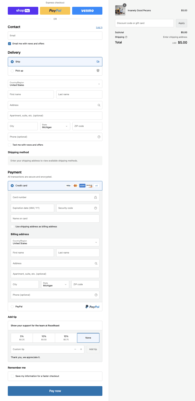
The current checkout page is one long form that requires the user to scroll far down the page, making it time-consuming to go back and double-check their information before finalizing their purchase. Through a complete redesign of the checkout process, the goal is to enable the customer to checkout more quickly and with greater trust.
Impact: A more logical, quicker, step-by-step checkout process will increase user confidence in the process and reduce the likelihood of abandoned carts.
Design Process
From research, to sketches, to wireframes, to the final designs, here are the steps we took to complete the redesign:
Background Research
As this was for a class, SI 311.150, we all had the pleasure of visiting RoosRoast's headquarters to tour their facility and learn more about the company’s motivations behind tasking us with this redesign.
The staff at RoosRoast talked about the community they have in their in-person stores and their desire to enable their online customers to feel the same love that the in-store ones do. Knowing more about their background was critical to us in formulating ways to make their website as personable as RoosRoast is. More information can be found here.
The second part of our background research was evaluating their website using research conducted by Baymard Institute. Baymard Institute provides UX best practices for e-commerce websites.
Sketches
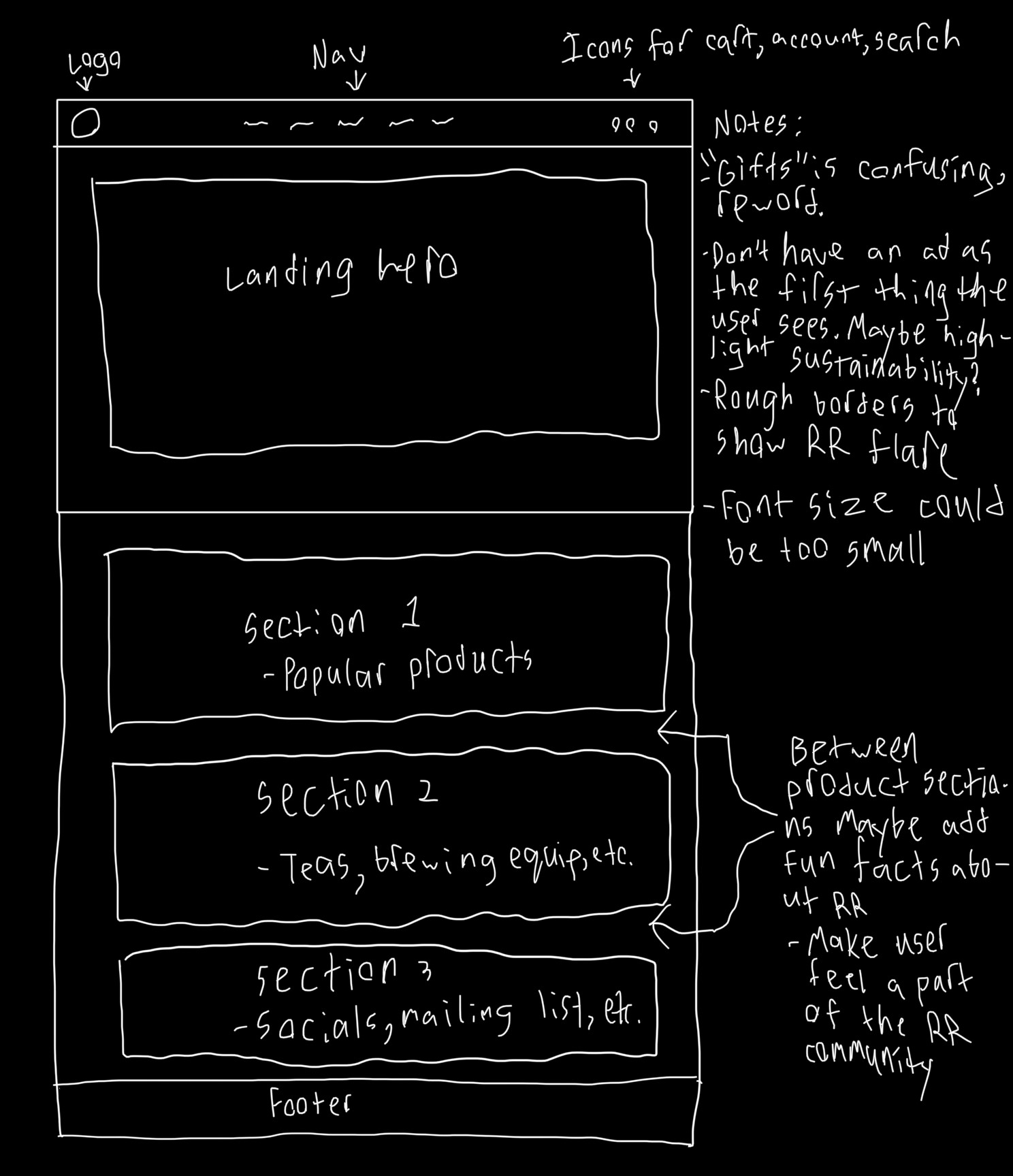
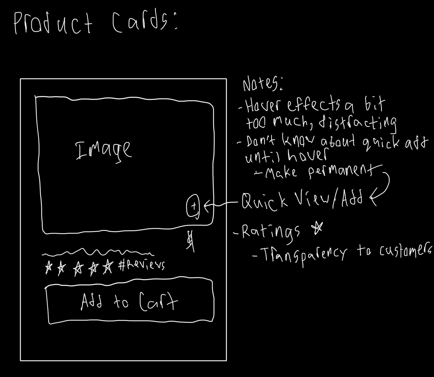
I sketched layouts to help our team quickly visualize the new structure of our designs. While extremely rough, these sketches were the foundation of our new designs and gave us a starting point for our wireframes.
Iterations
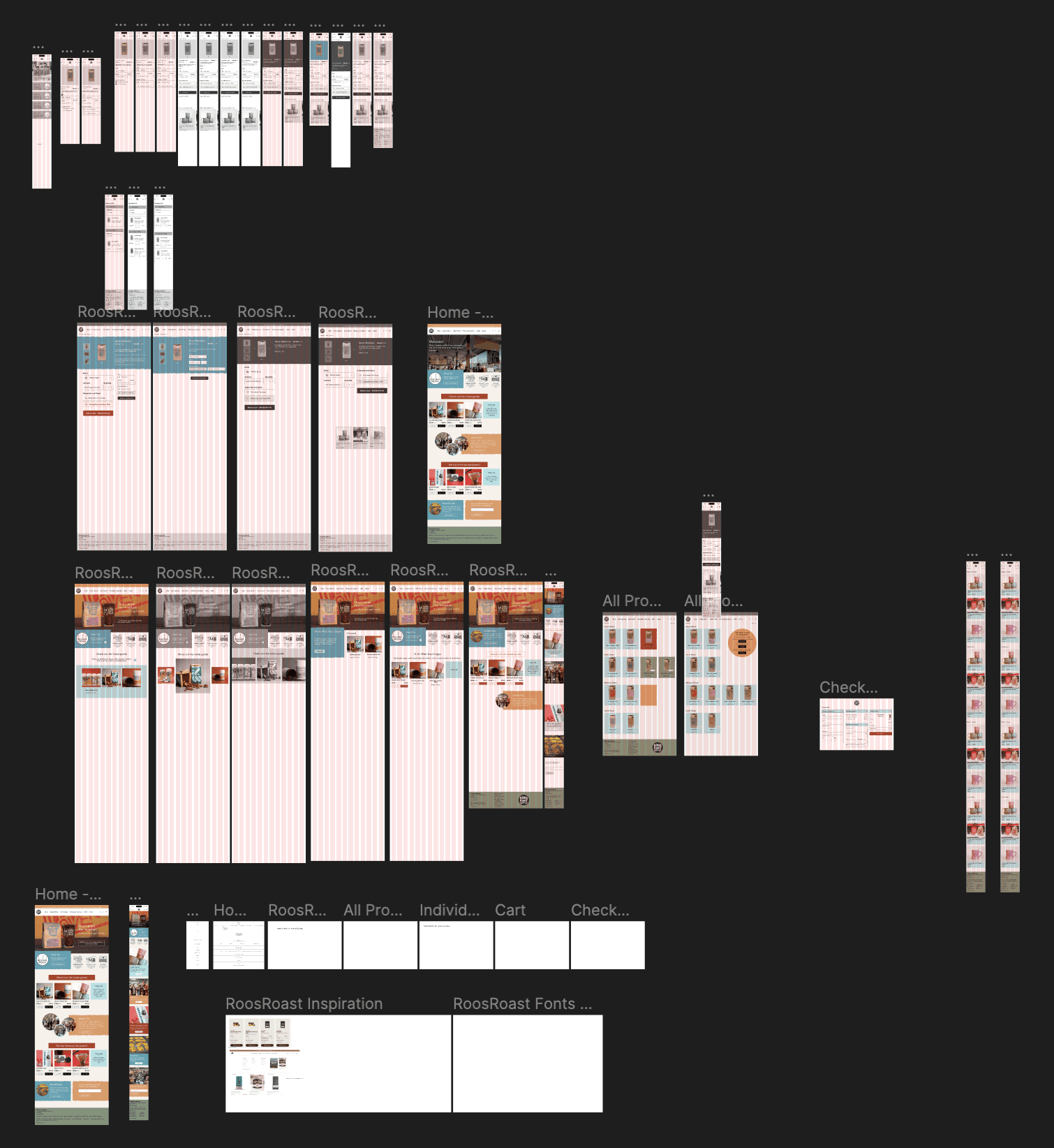
As with any design process, we went through many iterations. Our earliest wireframes captured the layout we wanted to start with and then we began adding in images and text. As we did so, we saw more and more opportunities for improvement and pivoted to accommodate for this. Below is a fraction of our "graveyard" of designs that didn't end up making the final cut.
Key Direction 1
Making Things Personal
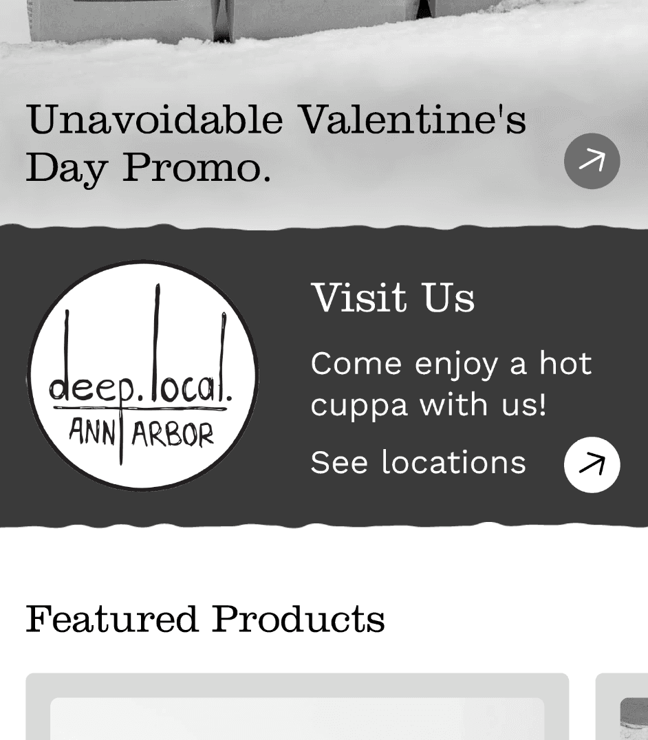
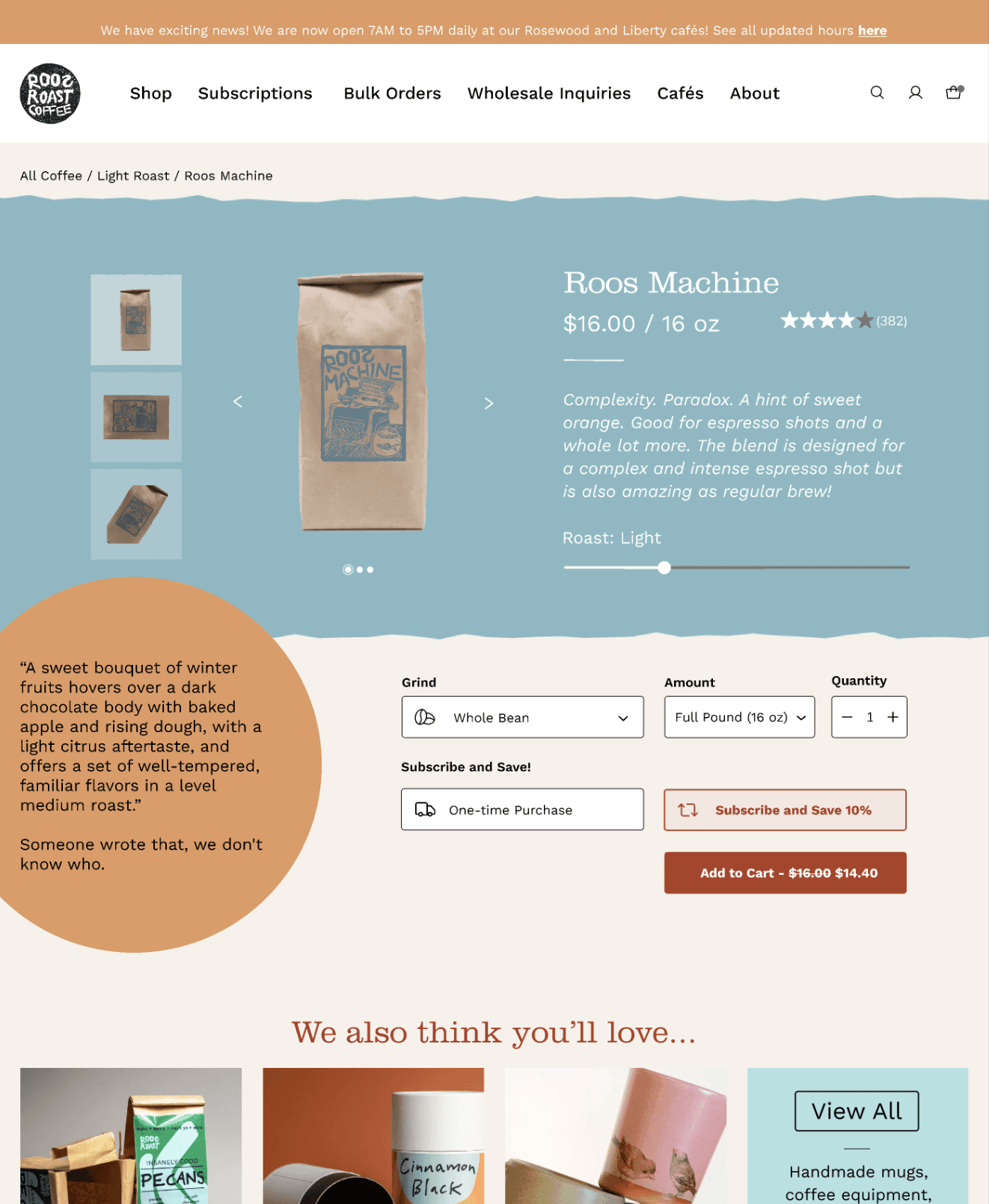
When creating our first wireframes, we placed emphasis on breaking up product sections with various information about RoosRoast, making it a more personal experience. We paid close attention to the wording, making sure it was spunky, fun, and inviting, just like RoosRoast!
Additionally, we added rough borders to certain elements on the site to give it an organic, earthy feel that we felt aligned better with their styling.
Key Direction 2
Reviews and Descriptions
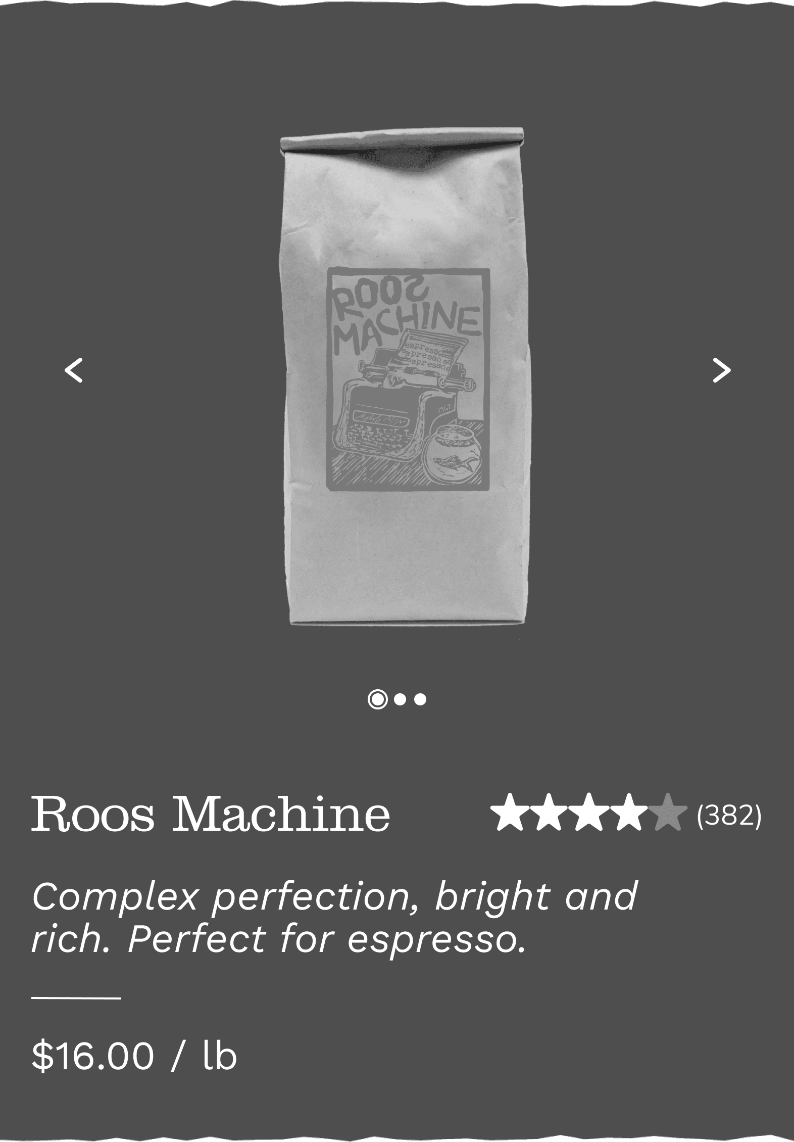
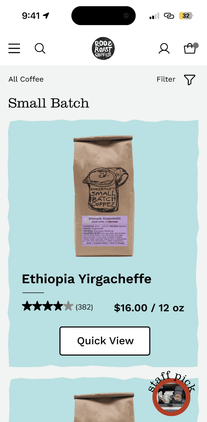
The current RoosRoast website does not have reviews on product pages. This can reduce trust between the store and the customer and makes it impossible for the user to make an informed decision based on community thoughts. Displaying the average rating and number of reviews also meets Baymard guideline #441.
We also added short taste descriptions so users can quickly get an idea of the coffee’s flavor profile, speeding up their search process.
Key Direction 3
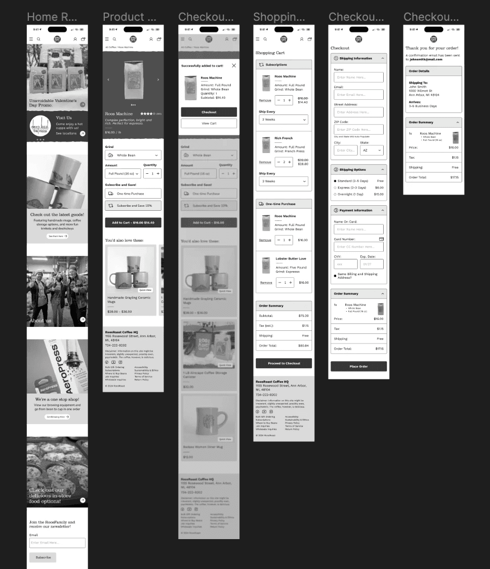
Collapsible Checkout
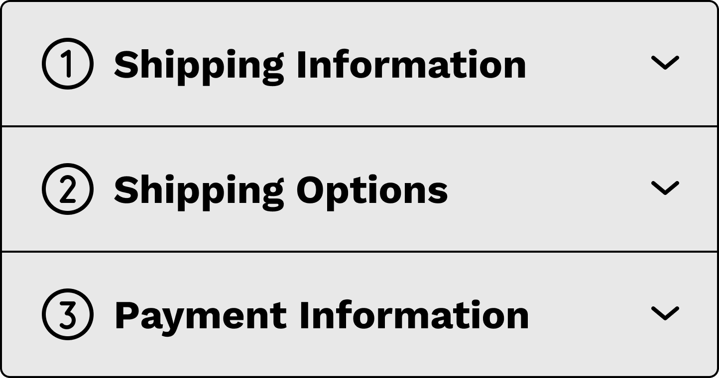
Checkouts can be confusing and stressful. The collapsible sections make it easy for the user to confirm their information before purchasing, without having to scroll through a long form. Separating the checkout form into multiple parts also makes it more approachable, making it less likely for the user to get overwhelmed.
Testing
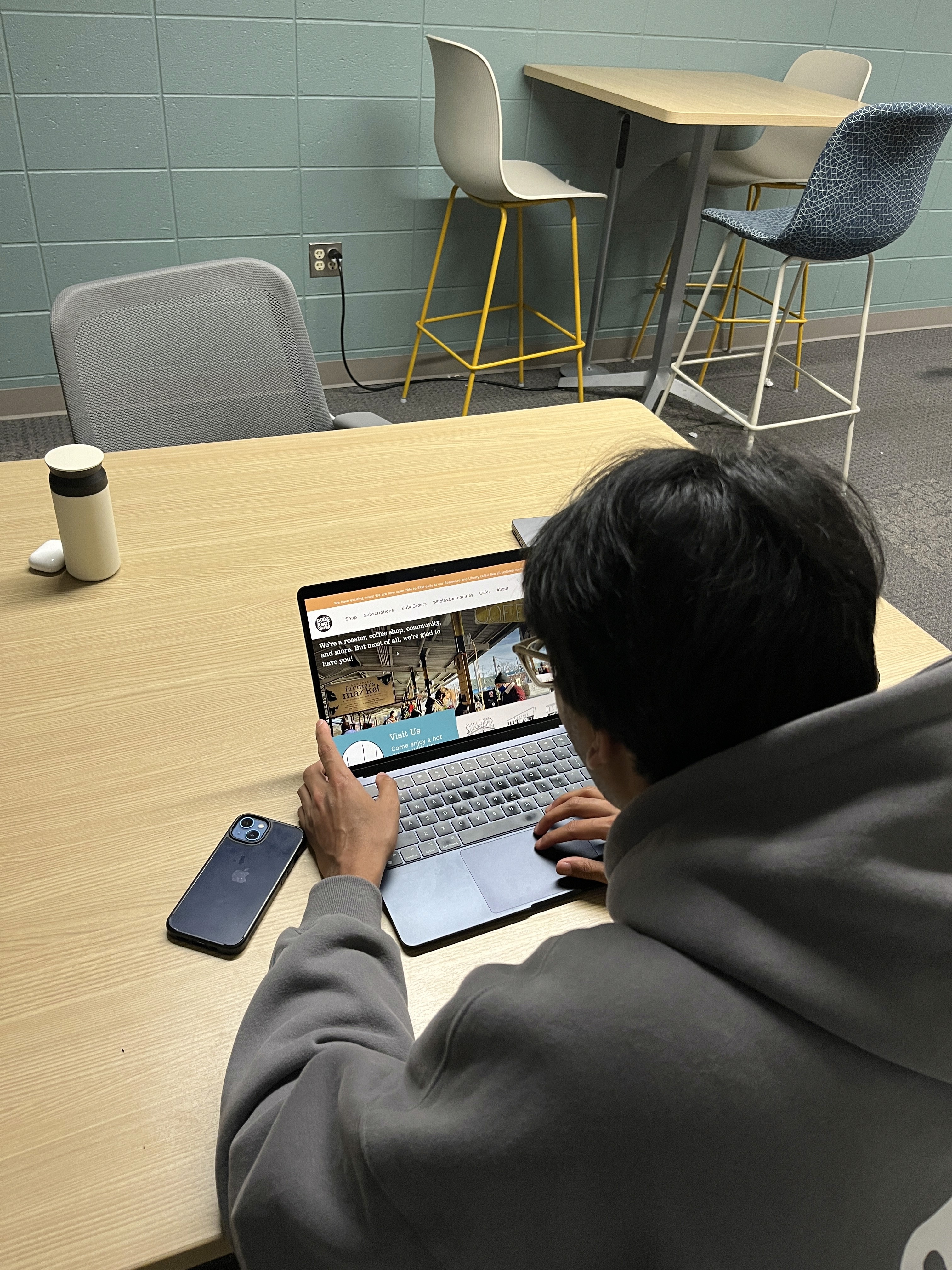
To test our prototypes, we conducted A/B testing with friends who knew about RoosRoast and some who didn't in order to get a mixed pool of testers. We monitored their actions and noted when they were getting stuck or when things were going smoothly on the current RoosRoast website versus our prototype.
Final Designs
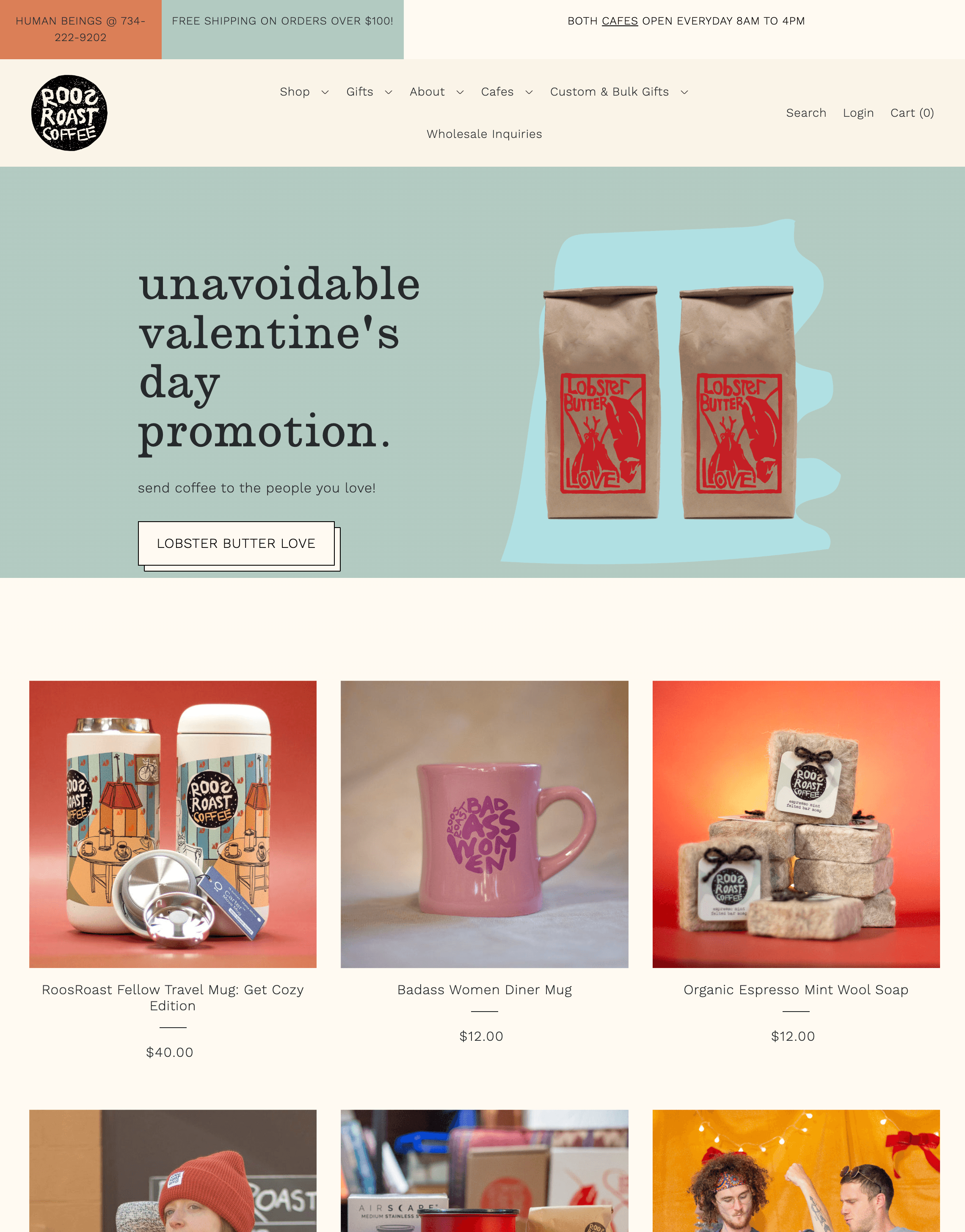
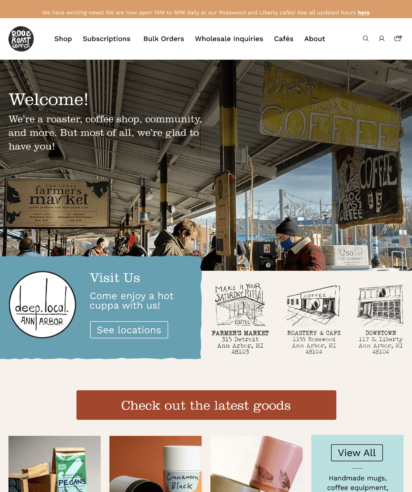
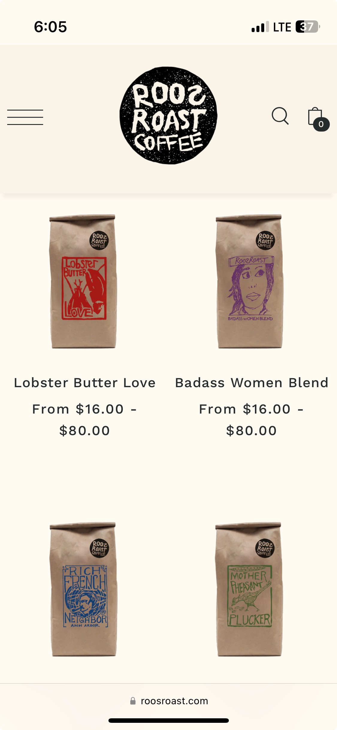
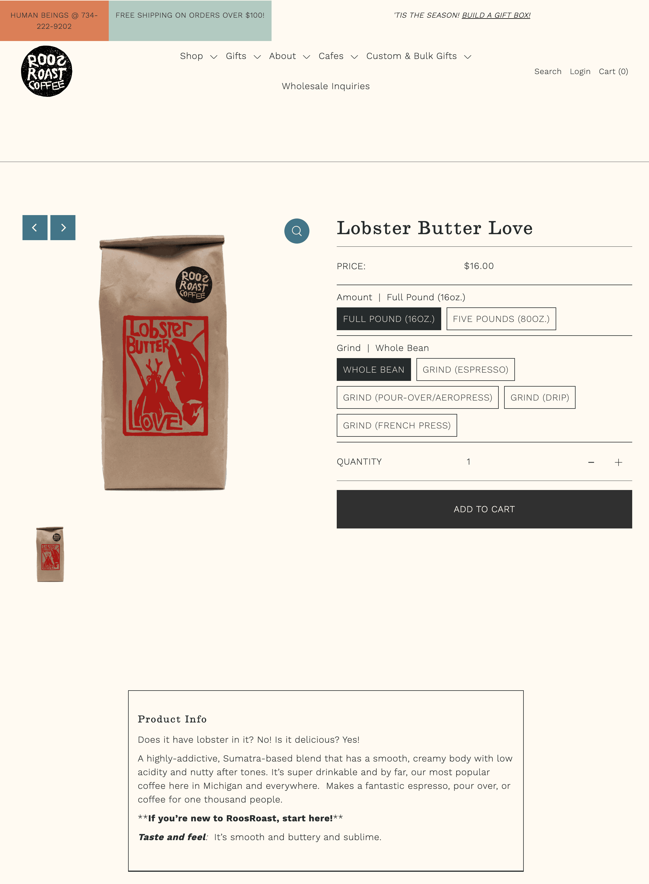
This section is currently being updated but here are some highlights of the new design with before and after images. If you are interested in viewing the full mobile + desktop designs they can be found here.
Before
After
Before
After
Before
After
